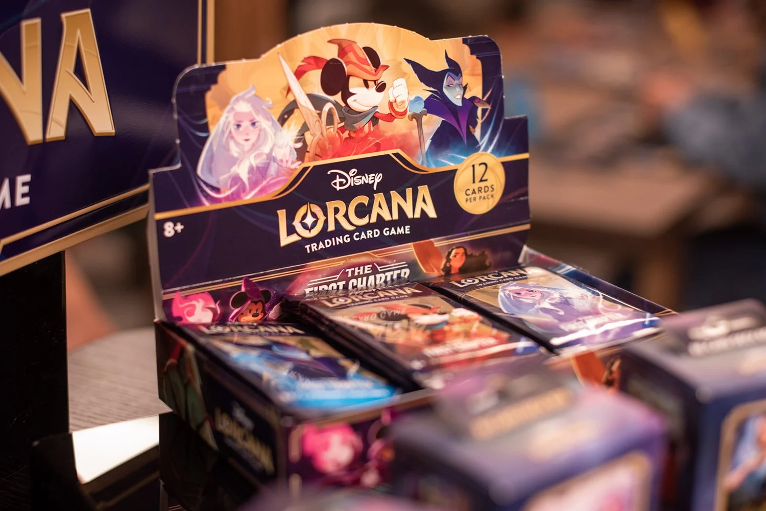
DISNEY LORCANA TRADING CARD GAME
I joined Ravensburger North America in 2021, at the beginning of development for Disney Lorcana TCG. As one of the first members of the Creative team for Lorcana, I was able to help shape the look and feel of the brand identity, develop the the packaging for the first few sets, and lead card design and creation, in addition to guiding art directors and illustrators in their work.

Assignments: On various sets, graphic design of packaging components, art direction for set look and feel, art direction of set logos, 3D renders of product imagery, layout and typesetting for all English cards (on all sets to date), creation of automation systems for card layout, design and art direction for special print treatments such as OPWs, hot stamping, spot UV, etc., art direction for special card illustrations, graphic design or art direction of new card frames…
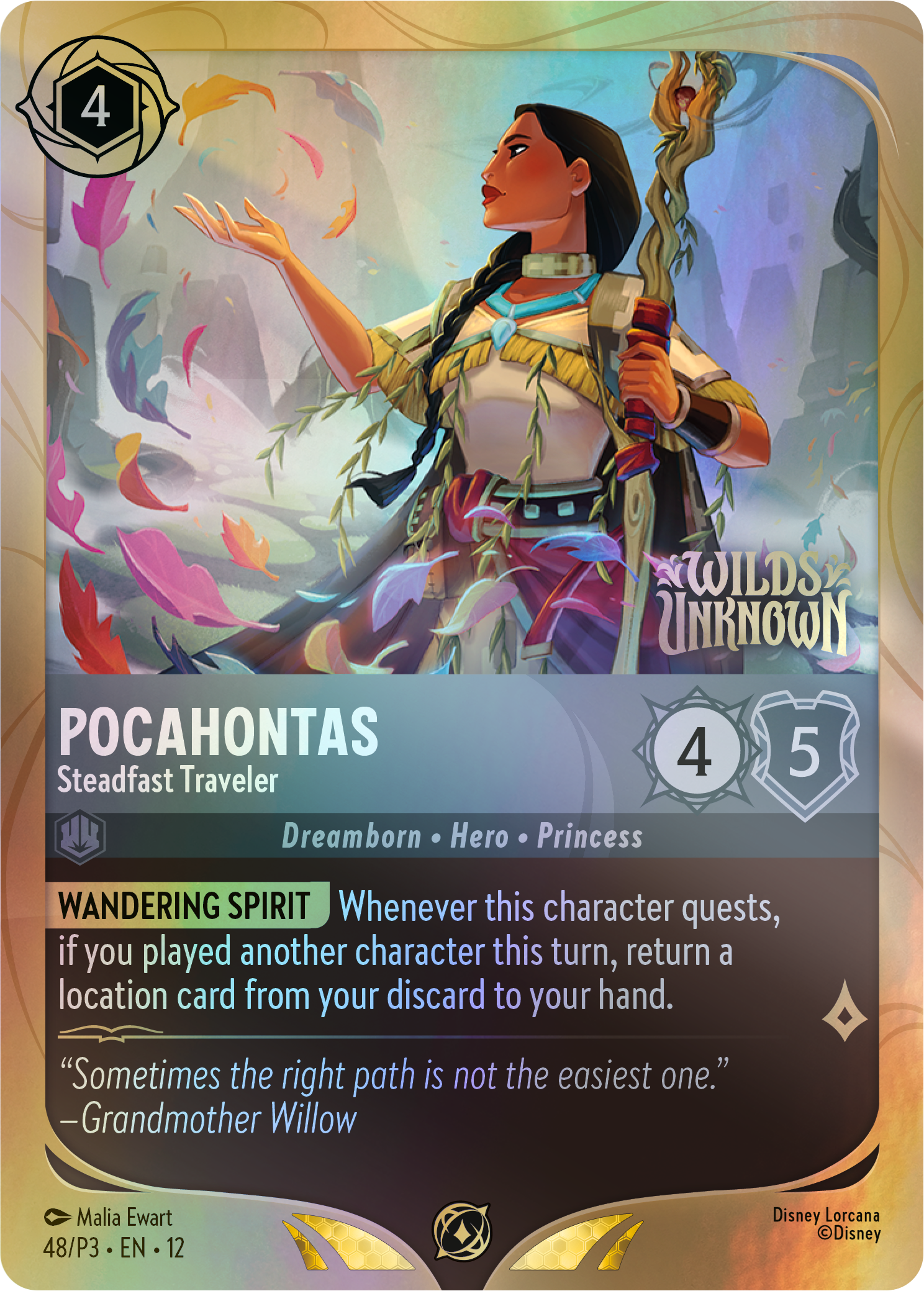
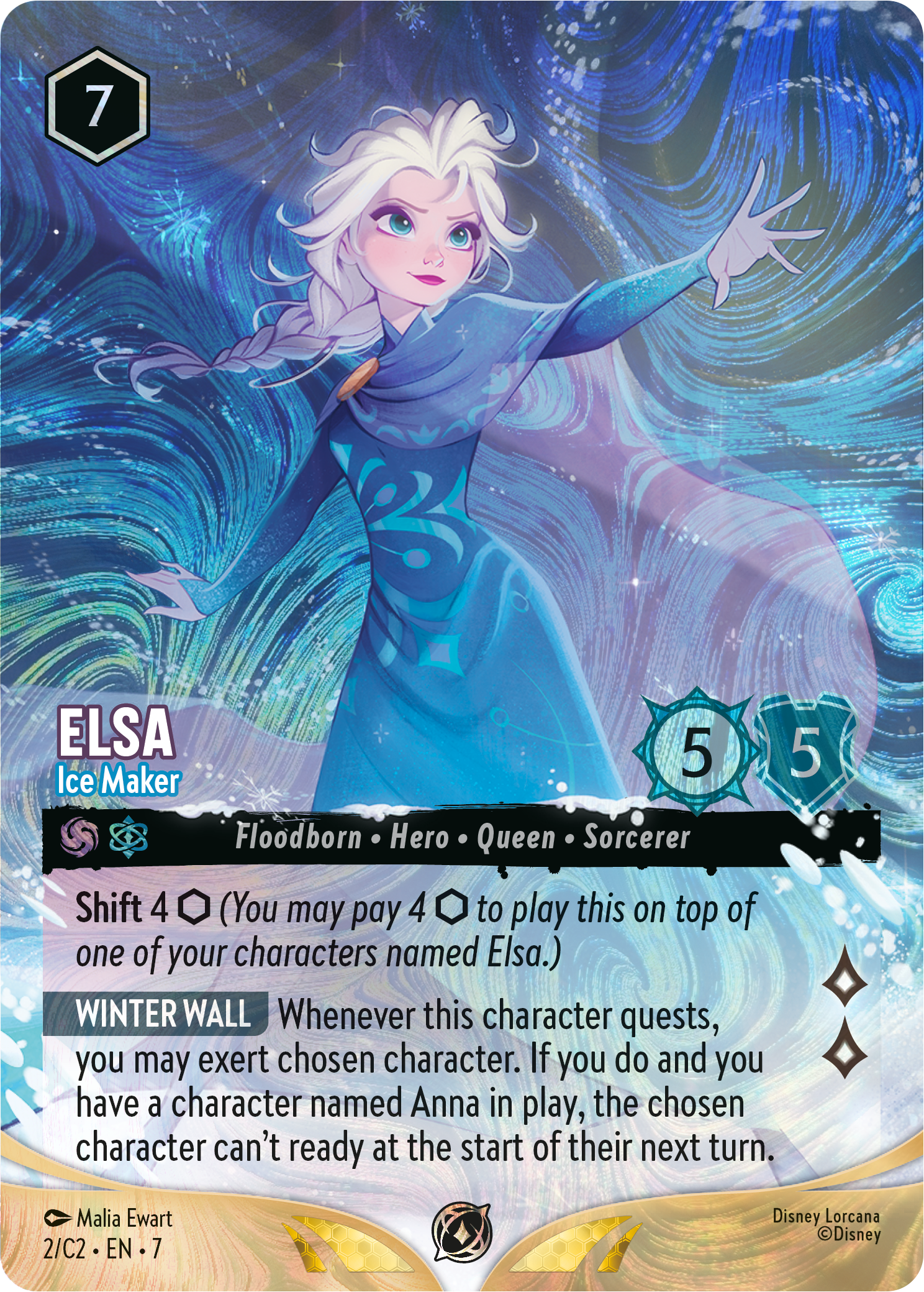
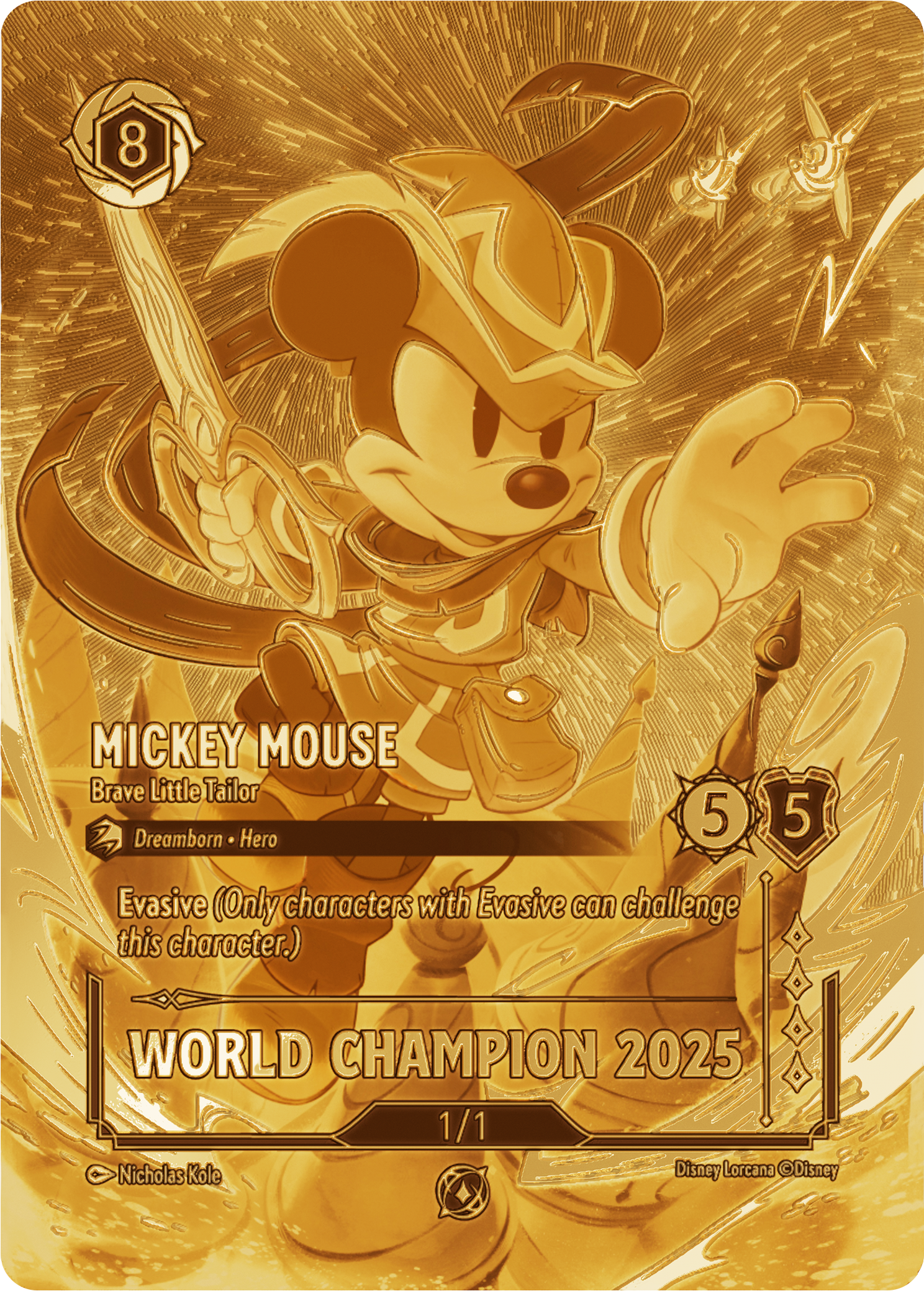
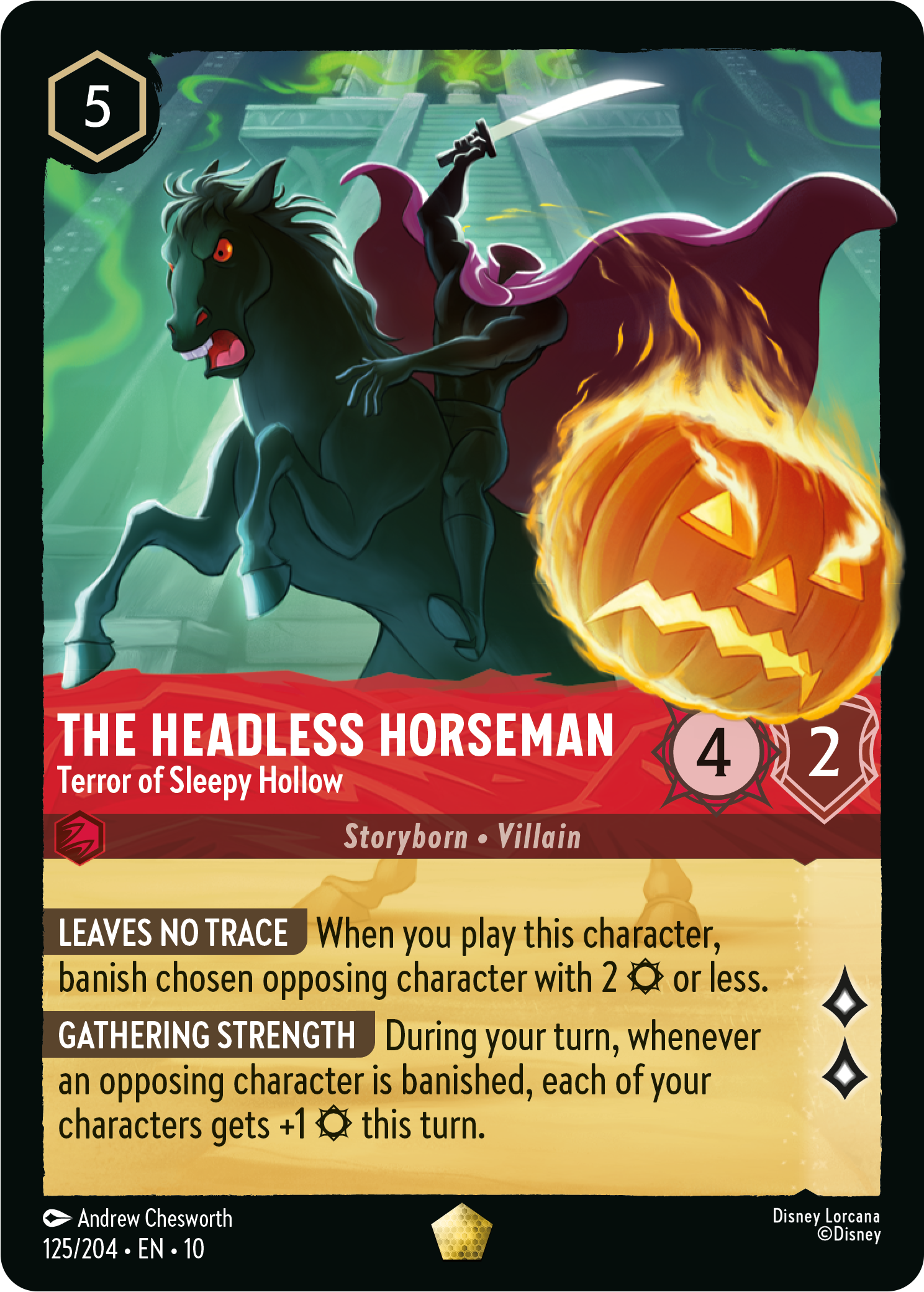
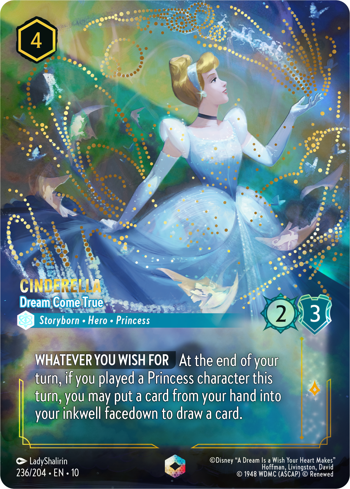
CARD/FRAME DESIGN
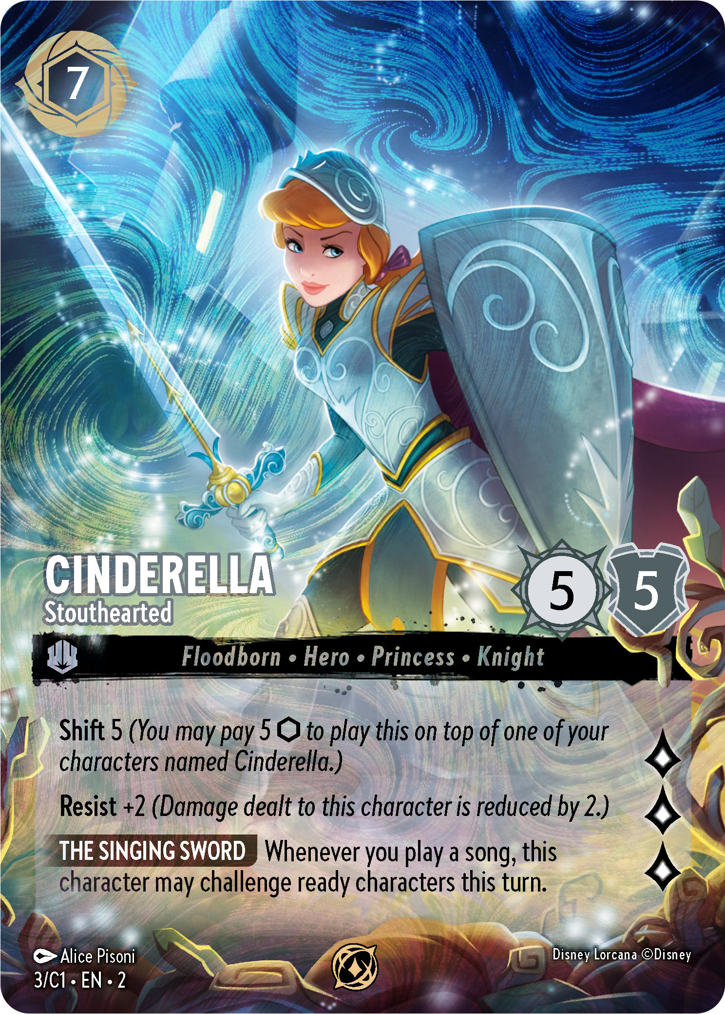
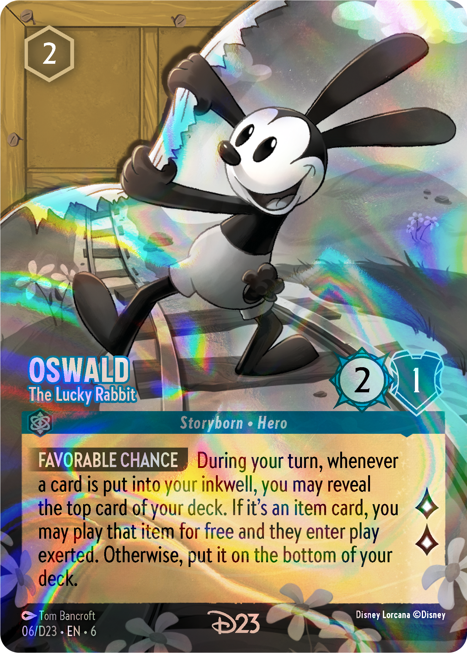
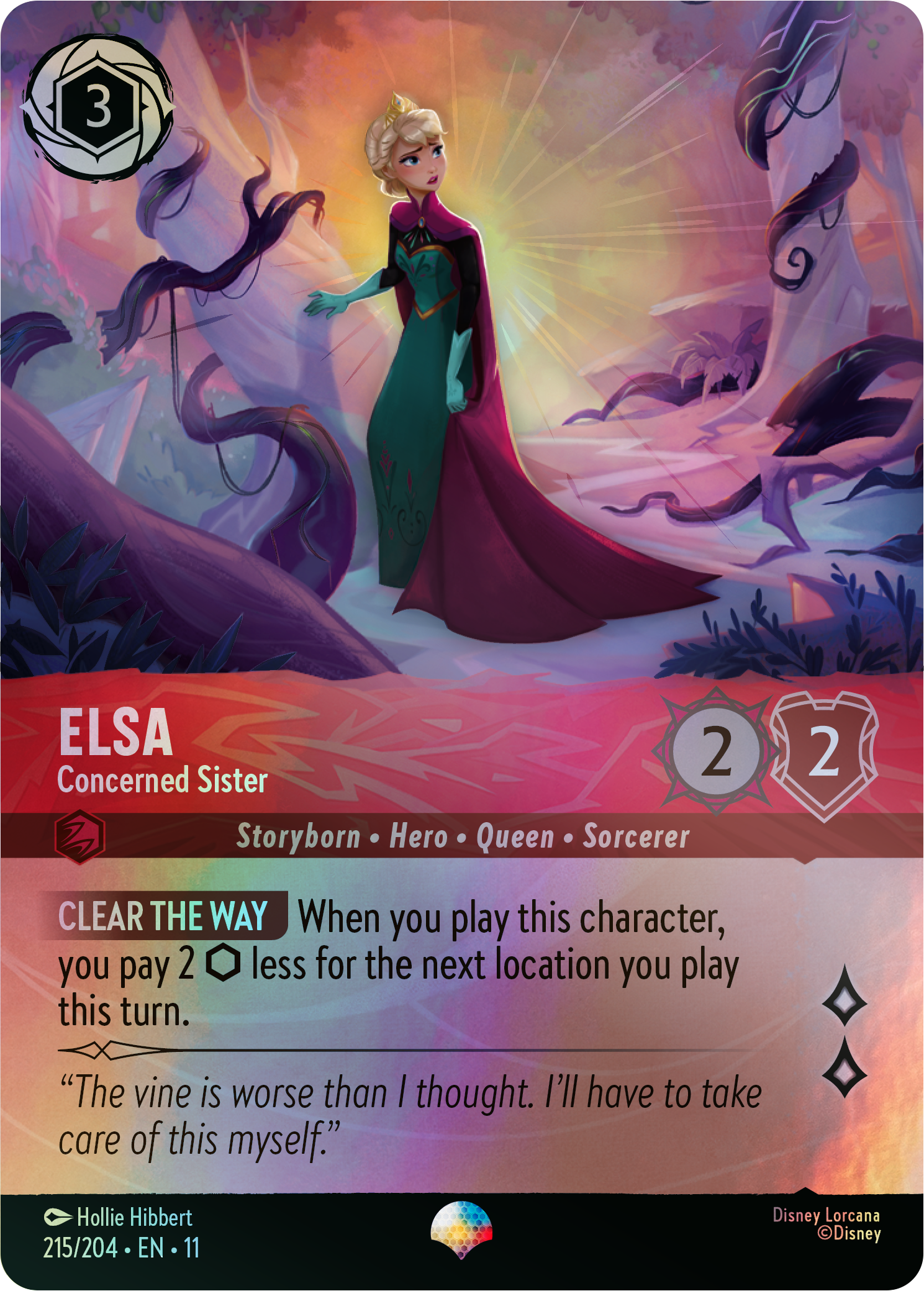
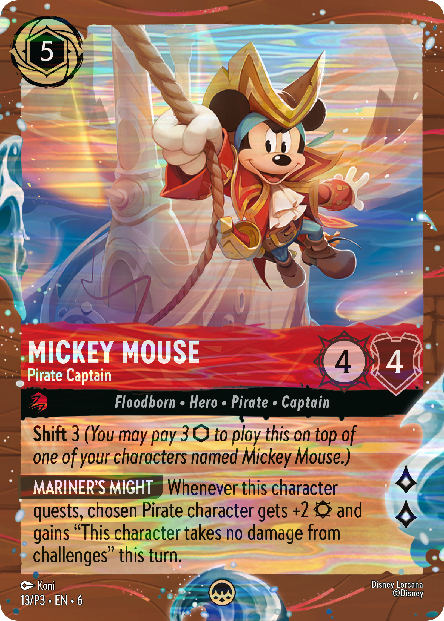
Since Set 1, I have designed and art directed many new card frames, setting up templates and print treatments for them. The card frames shown here range from slight variations on our standard frame to full redesigns for special cases such as collector’s sets, promo cards, and even new rarities. Each time a new card frame design is created, I work with the art direction team to provide them with new templates for illustrators to follow, and give guidance on the intended final design of a card. For every set that we make, I am involved in guiding the artists and art directors, choosing foil substrates and embellishments, and designing new card frames. Below are some of my favorites.


THE FIRST CHAPTER
Duties:
Art Director (set branding and logo, white plates, gift set packaging)
Graphic design (packaging - starters and boosters)
3D Renders
Card layout and typesetting (English, French, German)
Press check
On Lorcana’s first set, I designed the packaging for starters and boosters, setting the template for all future sets. By combining strong character art, a prominent logo, and various narrative elements such as the “Illuminary" pillars and flowing ink, these pieces established the look and feel of the brand.
Working with designer James Arnold, we also established the main colors of the brand, indigo and gold, and created evergreen assets such as our magical ley lines.
I also created the 3D renders shown here for use in advertising and sales.


AUTOMATION TOOLS & CARD LAYOUT
During development of Set 1 “The First Chapter,” I was able to spend time leveraging a plugin for InDesign called “Easy Catalog” (originally meant for book layout and catalogs) to develop a sophisticated method for automating card layout, similar to InDesign’s Data Merge function, but with more flexibility. Using GREP tools and regular expressions, I was able to put together a system that allowed me to generate 204 cards (a full set) in a few minutes, with nearly finished styling.
Then, with the help of a programmer, we created a series of Apple Scripts to help batch artwork into the various assets we would need to drop into an InDesign file. With both of these processes in place, I was able to typeset all the cards for every language by myself.
RISE OF THE FLOODBORN

Duties:
Art direction (set branding and logo, card white plates)
Graphic design (packaging - starters and boosters)
3D Renders
Card layout and typesetting (English, French, German)
Press check
When we began designing the second set, “Rise of the Floodborn,” I directed the new look and feel of the set, re-theming all the packaging and assets to fit the narrative of the new set. Set 2 was all about Floodborn characters and their origins, and I drew inspiration from the Peter Pan’s Shadow card shown here, where the shadow flies through the “ink caverns.”
I worked with the artist of that card to create a new repeating pattern based on the cave walls from the illustration, which became the basis for much of the packaging.


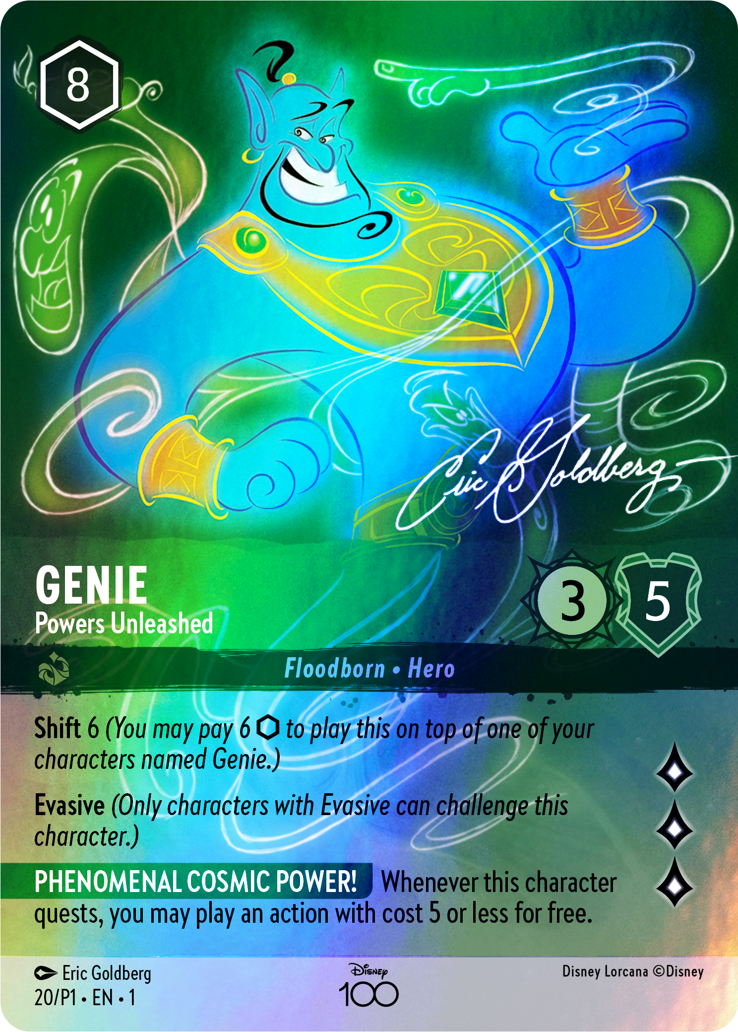
D100 CARD COLLECTION
Duties
Graphic design - card frames, white plates
Card layout and typesetting (English, French, German)
Press check
As part of Disney’s D100 celebrations, Lorcana was able to make a very special set of 6 cards featuring alternate art drawn by legendary Disney artists such as Erig Goldberg and Mark Henn, to be released in a gift set along with “Rise of the Floodborn.” For these cards, I designed a new card frame that allowed us to blend our own look with Disney’s D100 style guide.
I created the white plates and did all the layout for these special cards. Getting to work on art drawn by the original animators of some of these classic characters was an unforgettable experience, and a real honor to be entrusted with making their work look as good as it could.


INTO THE INKLANDS
Duties
Art direction - set branding and logo, white plates
Graphic design - packaging (starters, boosters)
3D Renders
Card layout (English)
For “Into the Inklands,” I helped art direct the branding for the set, which took things in an “Indiana Jones” / adventure direction I was very comfortable with. A dramatic shift in colors made this set stand out a lot when compared to the other sets. This was also the first set in which we worked with an artist to create new background illustrations featuring actual scenery for the booster packaging, which was fun to lead.


