TYPOGRAPHY


PROJECT SPOTLIGHT
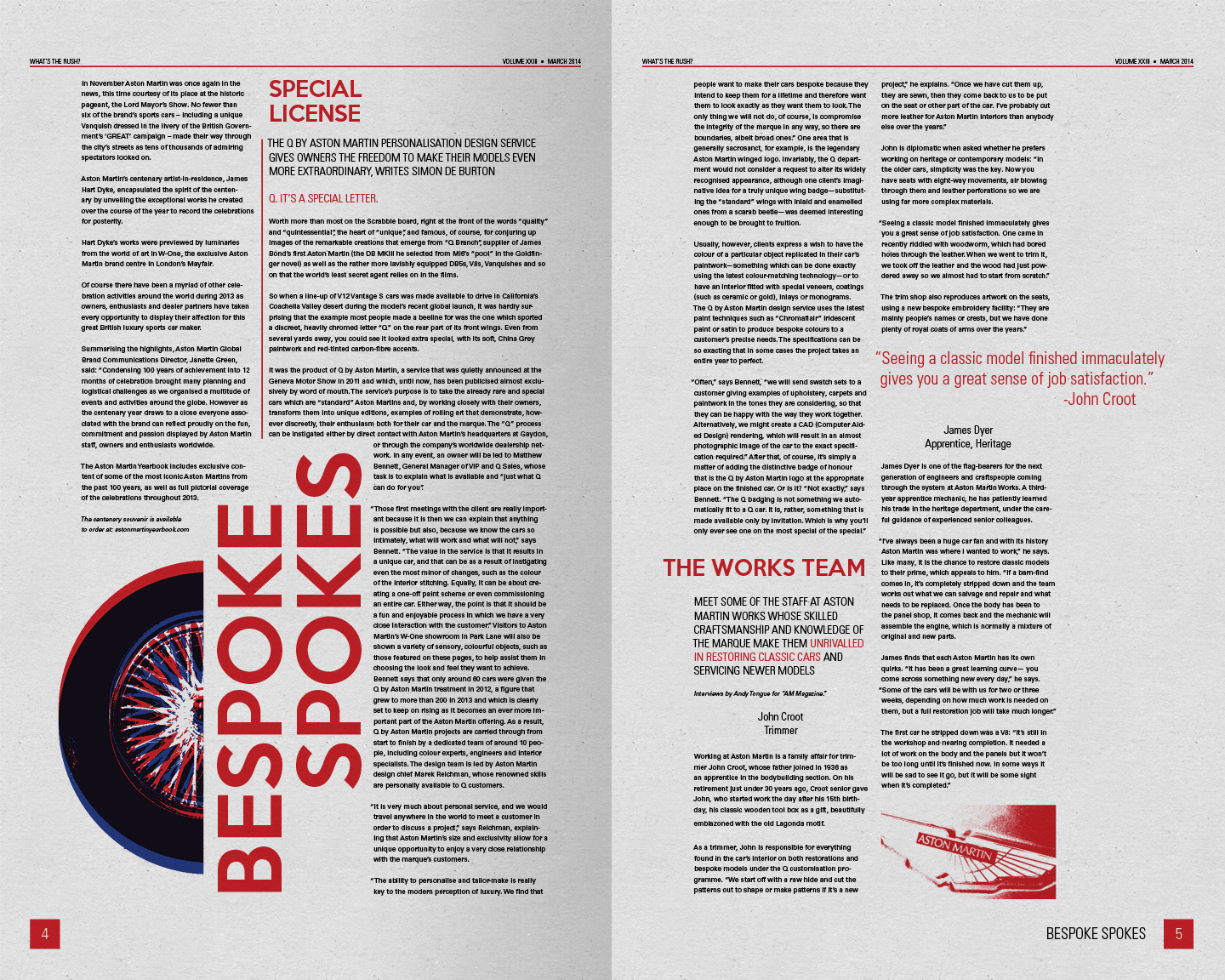
"Whats the Rush?" Newsletter
The Concept
This newsletter was created for a typography class, wherein the assignment was to select an ambiguous title from a group of 5 options and create a full newsletter, using original imagery and text borrowed from an existing source, edited and tailored to fit the project needs. The finished newsletter measures 10 x 16" per page, and was printed on newsprint and hand assembled.
For my newsletter, I selected the title "What's the Rush," and created this newsletter for classic Aston Martin car owners. The title is a play on the idea that these classic cars aren't necessarily the fastest (being quite old). For my design, I was inspired by 60's style modern art, using sharp lines and bold colors referencing the period of time associated with the most famous models of the Aston Martin line.
I used several cuts of Adrian Frutiger's 1954 typeface "Univers" for parts of the title treatment as well as the entire body text. For the main "RUSH" part of the header as well as for section headers, I used a typeface called "Keep Calm," which is based on the famous "Keep Calm and Carry On" posters seen throughout England during the Second World War. Red, white and blue colors hearken to the Union Jack, and on the inside of the newsletter, extensive use of the red in particular create a connection to the British red as seen on Queen's Guard and the famous "redcoats" of the British Army. This combination of modern sans serif typefaces and bold historical colors gives the newsletter a firmly British and modern background.

Photography
To create the imagery used in the newsletter, I staged a small photo shoot with a 1:16 model of a 1964 Aston Martin DB5. Photos were shot from a low angle on a seamless white background to make the car look larger, and after some small touch ups in Photoshop, they were ready to be placed into the newsletter.
In addition to the photos of the DB5 and British flag, solid geometric shapes such as arrows, squares, and circles were used to highlight and add interest to the imagery as well as to further reference modernism. In some cases, such as in the arrows on the cover spread, a mis-registration or overprint effect was used to create a vintage feel.
Content
Content was collected and edited from existing sources. Articles were selected to present a slightly broader range of interests including modern Aston Martins and the James Bond films that the brand is so closely related to. This was done in the interest of presenting Aston Martin owners with content that they may also be interested in, and content of this nature would appear in these newsletters as special features, alongside the usual information about club gatherings, the history of the marque, and articles detailing specific vintage models such as the DB5 featured in this issue.